01
Corra, 2024
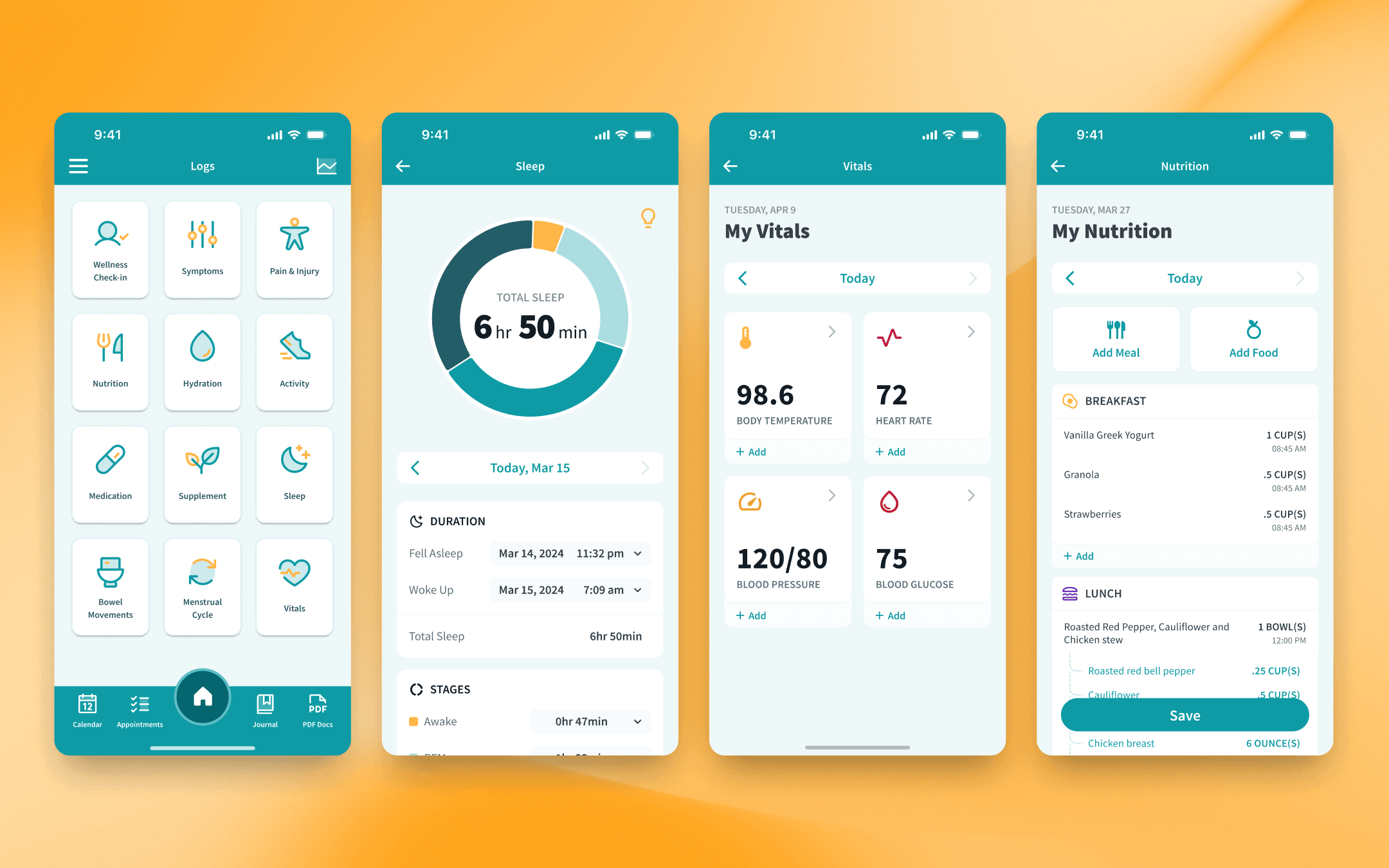
In this project, I worked with the founder and product management on generating updated designs for a mobile app built to help people with chronic health issues. I focused my process around finding the right balance between understanding and managing the health issues users faced in their day-to-day lives and in the processes of tracking the information within the app.
02
Process
The Basics
For all my projects, I like to start with establishing a foundational set of elements - mainly styles and basic UI elements. I feel like this is an easy step that provides a great deal of value, laying the groundwork for quicker design turnaround and consistent, user-friendly products. A step like this can often be overshadowed by higher priority tasks, but the design debt that will build up can potentially derail future work and improvements.
Use Cases
Hand in hand with creating any sort of foundational design elements is the need to gain a certain level of understanding of the users. Who are they? What are they trying to do with your product? How do they do what they do? What problems do they really face? It’s impossible to create “perfect” designs that satisfy EVERY possible use case, but that shouldn’t prevent us (founders, designers, etc.) from trying to gain an understanding and some empathy for users.
Feedback Loop
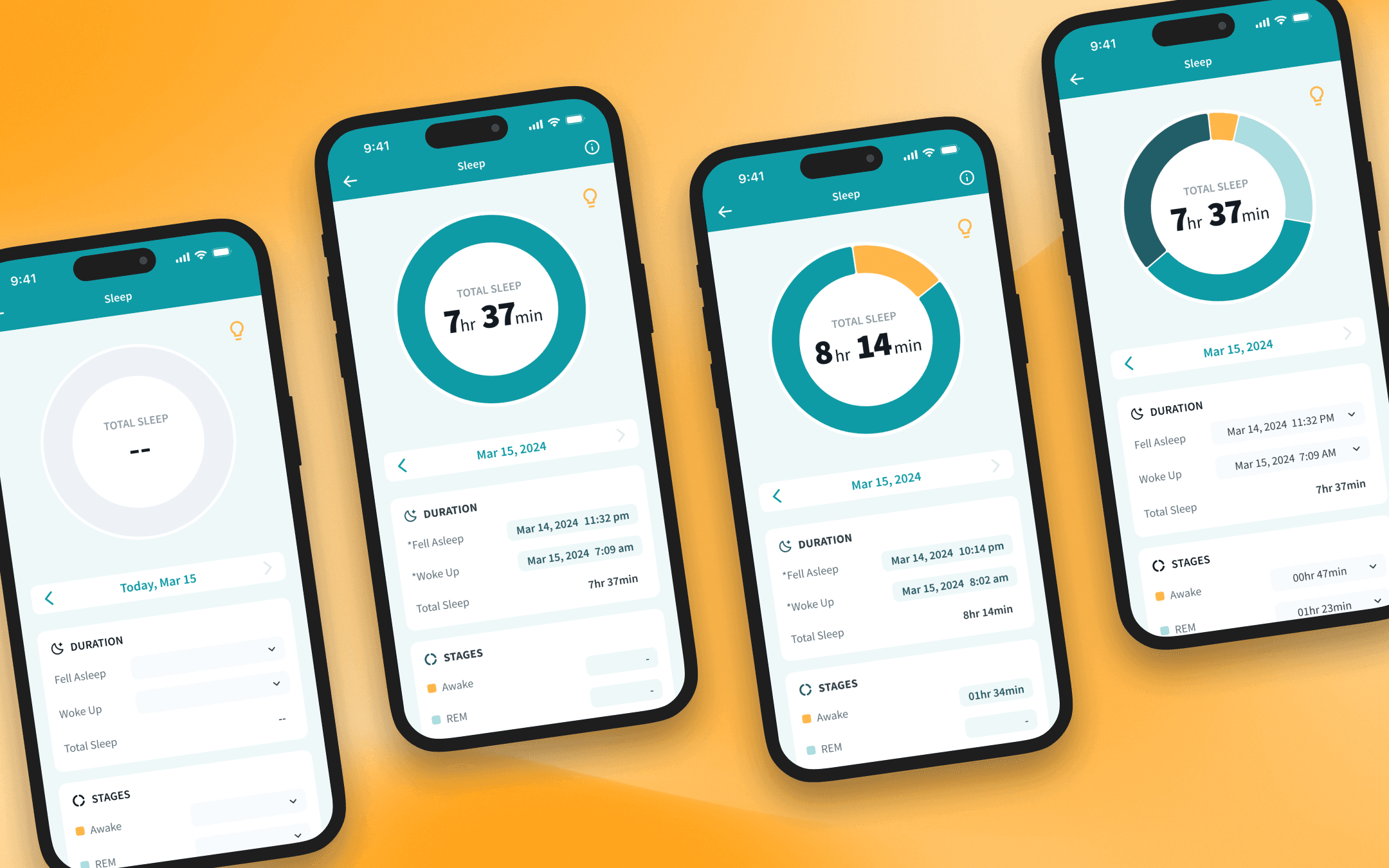
User feedback requires a nuanced approach to understand and leverage, but it can yield invaluable information. For the work on this project, we were fortunate enough to have a direct line of contact with motivated, current users. Reviewing designs with the users provided valuable insights, like how recurring hand pain impacts any manually input information tracking - a literal need for only the most necessary clicks.


03
Outcome
The redesigned app represented a meaningful step forward in making chronic health management more accessible and less burdensome for users dealing with ongoing health challenges day-to-day.
A key insight from user research — that recurring hand pain made manual data input genuinely difficult — directly shaped several design decisions. Text input was minimized wherever possible in favor of simpler, lower-effort controls like sliders, toggles, and checkboxes. This wasn't just a usability improvement; it was an empathy-driven decision that made the app meaningfully more usable for the people who needed it most.
The work established a stronger design foundation for the product, with simplified tracking flows and clearer data views — setting Corra up for continued iteration as the product grows toward its goal of becoming an integral part of users' health management.

